Have you been looking for the definitive review of
Windows Phone 7? Well, look no further. Microsoft's next (and perhaps final) opportunity to break back into the smartphone race has officially begun, and Engadget has been cranking on a variety of launch devices across several continents to see if the platform holds water.
Back in July we took a
deep dive on Windows Phone 7 using a developer device that Microsoft handed out to journalists, and now we're back for the full review. What we realized going into this process was that really very little had changed between the summertime preview and the new OS' fall launch. Even though there have been tweaks and fixes in Microsoft's mobile experience, there hasn't been any addition so large that we felt the software required a completely fresh look. Instead, what we needed to do was go back to the observations made during our initial experience with the OS, compare it to the final product, and figure out where the company improved (or diminished) specific facets of the operating system. And of course, we finally had a real chance to use
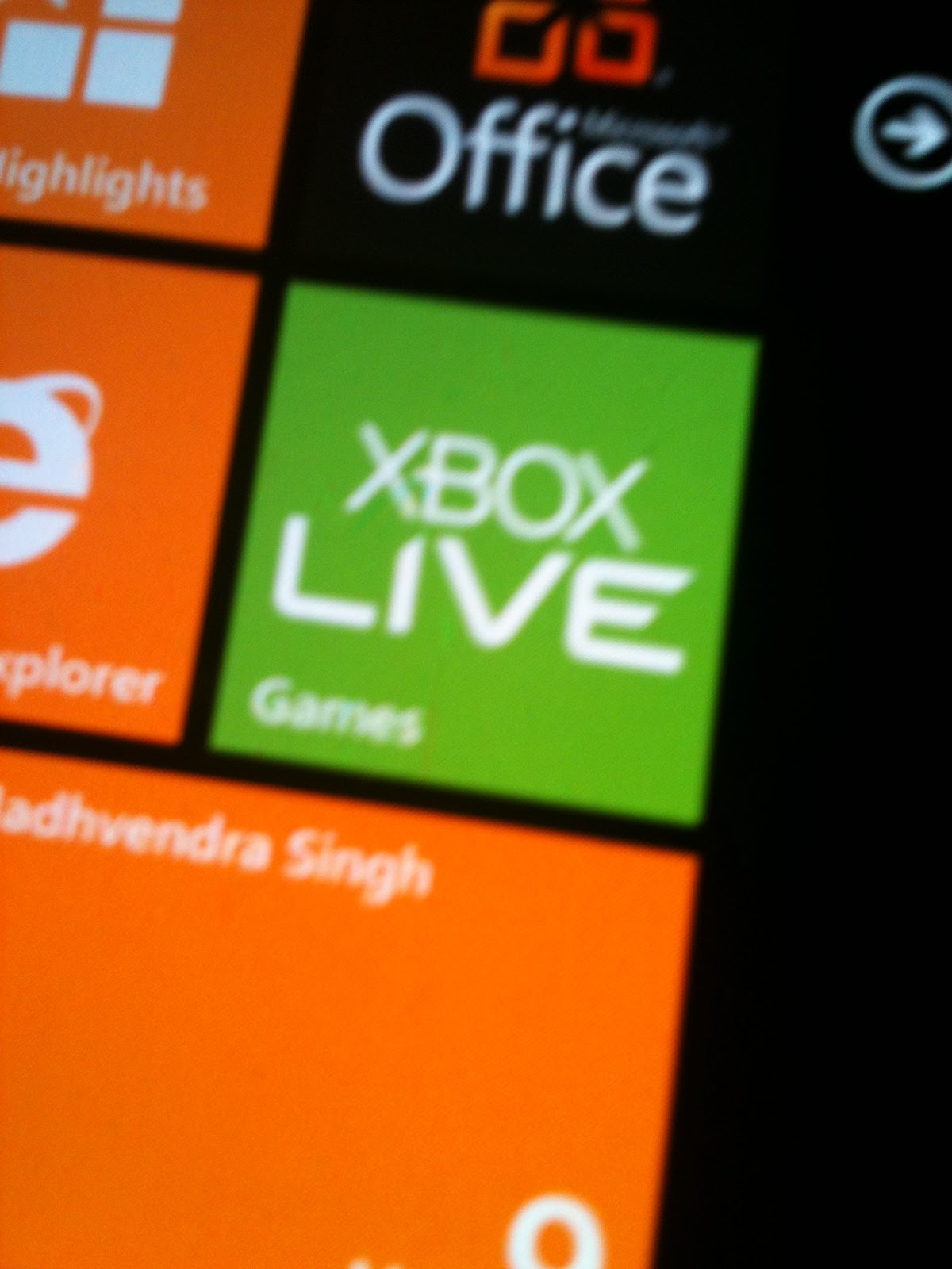
Xbox Live and third party applications -- two of the crucial elements of this OS. So, below is our re-edited, refreshed take on Windows Phone 7, complete with real answers to nagging questions, and our definitive score of Microsoft's great smartphone hope at version 1.0. Read on for the full story!
Overall look and feel
What you've likely already seen of the Windows Phone 7 user interface has barely changed since our last look.
As before the "Metro" UI is in full effect here, meaning lots of very 2D, stark blocks of color and text. Actually, 2D isn't quite right -- the interface utilizes a lot of layers within a single page, so when you're swiping through menus you get a kind of parallax scrolling effect reminiscent of 16 bit side-scrollers (think Castlevania for the SNES). It actually works really well here, giving a sense of depth and detail but not detracting from the content Microsoft is putting up front. Of course, the controversial cut-off text is still present, and while we happen to like the way it looks, it's definitely an acquired taste, and there are times when it just doesn't work, like in the Office hub where PowerPoint looks like it reads "PowerPoir."
We're still extremely impressed by the software's touch responsiveness and speed. In fact, this is probably the most accurate and nuanced touch response this side of iOS4. It's kind of stunning how much work Microsoft has done on the user experience since we first saw this interface -- everything now comes off as a tight, cohesive whole. We haven't seen any substantial interface lag while using the device, and the short transitions between applications or pages are well suited to the overall experience, although we'd appreciate a way to shorten them or turn them off in some cases -- we don't necessarily need to watch the homescreen tiles spin away and back again every time we open and close apps.
Getting around the OS really comes down to three main sections: the homepage "tiles," (a list of glanceable information, updates, and favorite apps or people), the application list (an alphabetical list of all your applications), and the "hub" pages (really a kind of in between point that's sandwiched between a full on app and a menu). We found the overall navigation of the UI to be really quite intuitive, despite the fact that a good number of options and in-app menus are accessible only through a long press... something you're not really made aware of in most cases. The long press becomes a bit like the skeleton key of the OS -- you just have to try it and see what kind of functionality it unlocks. Once you get into the habit of holding down on items instead of wildly searching for the next screen or tile, it makes a lot of sense, but it does take some getting used to.
We do have to question whether a long list of tiles and a long list of applications is superior to a grid (as seen in webOS, iOS, and Android). Honestly, scrolling down a long alphabetical list to find what you're looking for here isn't much easier than paging through a grid. And unlike iOS, webOS, Android, and even BlackBerry 6, there's no universal search option here to help you quickly find what you want. That's one thing we didn't expect to find ourselves missing, but became very noticeable very quickly. There's also only one homescreen and customization space is limited by the tile layout, so you end up scrolling vertically to find the right hub or app there too -- contrast that to Android, iOS, or BlackBerry, where you can arrange multiple home screens at will and quickly develop an organized workflow. We'd like to see options for three- or four-row tile rows at the very least -- it would go a long way towards making the homescreen more efficient.
For notifications, Windows Phone 7 relies on a drop down, Android-like window shade for messages, so Microsoft is already besting Apple there, and if you're playing music in the background, you're able to bring up your controls by tapping one of the volume buttons. Weirdly, though that same area up top is used to show your signal, battery, and WiFi status, the information only drops down if you touch or swipe the upper part of the screen. And in some apps (like pictures) it doesn't appear at all. We're not sure why Microsoft doesn't want to make that info consistent, but it seems like wasted effort to have to call it up manually. Unfortunately, Microsoft didn't take our advice and add more specific battery info (like a percentage number) to this area.
Other flourishes in the UI come in the form of subtle animations when something is loading or syncing -- a series of tiny dots that appear and coalesce in the upper portion of the screen. A small touch, but it's nice to know the phone is thinking or working. Otherwise, the UI mostly gets out of your way -- most apps don't have plethora of controls or options immediately visible. Just you and your content... and it actually really works here.
When we first covered the OS in full, there were two omissions that we felt were troubling, but at least one of those has a fix coming soon. As you've probably heard, the devices won't support copy and paste out of the box, and won't support third-party multitasking of apps. The former will be eradicated in the form of a software update coming in "early 2011" according to Microsoft, and we've actually seen the copy and paste function demoed by company reps, so it's definitely close. That's great news, though it would have been nice to see it on board to begin with.
The latter is practically inexcusable in this day and age -- even Apple (which has been a complete laggard in this area) now supports basic multitasking. This means that even something as basic as Pandora (an app which everyone at Microsoft has stopped talking about publicly) won't be able to stream from the music hub (though Zune can, oddly enough). It's doubly irritating given the fact that just like in iPhone 1.0, the first-party apps are free to background all they want (mail loads, the browser pulls down pages, music plays in the background, etc.), so there isn't any technical reason why they couldn't extend some of this functionality to other applications. We pressed Microsoft at the New York launch event on when or if multitasking would be coming to the platform, but the company was mum on timelines.
In day to day use, the lack of multitasking proved to be an even bigger annoyance than we expected. Not only is there no third-party support for the function, but if you lock your screen while you're in a third-party app (say, Twitter), the software must reload when you unlock! This can be especially annoying when you're playing a game which has a substantial load time (more on that below). It doesn't freeze your state, so you have to reload the app and your saved game all over again. It's not just bad -- it's nearly unforgivable. We'd be a little more lenient here if everyone hadn't already seen the light on this, but coming to the table with such hampered functionality just seems sloppy to us.
Overall, though, day to day use inside of this UI has been solid. Microsoft actually created a fairly intuitive, tightly woven operating system. We did see some occasional lagginess and freezes, and we had some troubling issues with third-party app performance (more on that in a section blow), but for a first generation, brand new OS, the folks in Redmond have done a pretty impressive job.

 Comes with Windows Phone 7.5 Mango OS and 800 Mhz processor, the smartphone is the 8th one to join the NFC range of Nokia. The Nokia Lumia 610 NFC will be headed to Orange network first. Specification wise the Windows phone from Nokia sports a 3.7 inch capactive touchscreen display with Corning Gorilla Glass protection, a high end 5MP camera with geo-tagging and face detection.